
Whether your community is a flourishing business, a non-profit or a tight-knit group, we’ll collaborate to create captivating identities and spaces that produce concrete, impactful outcomes.
CASE STUDIES
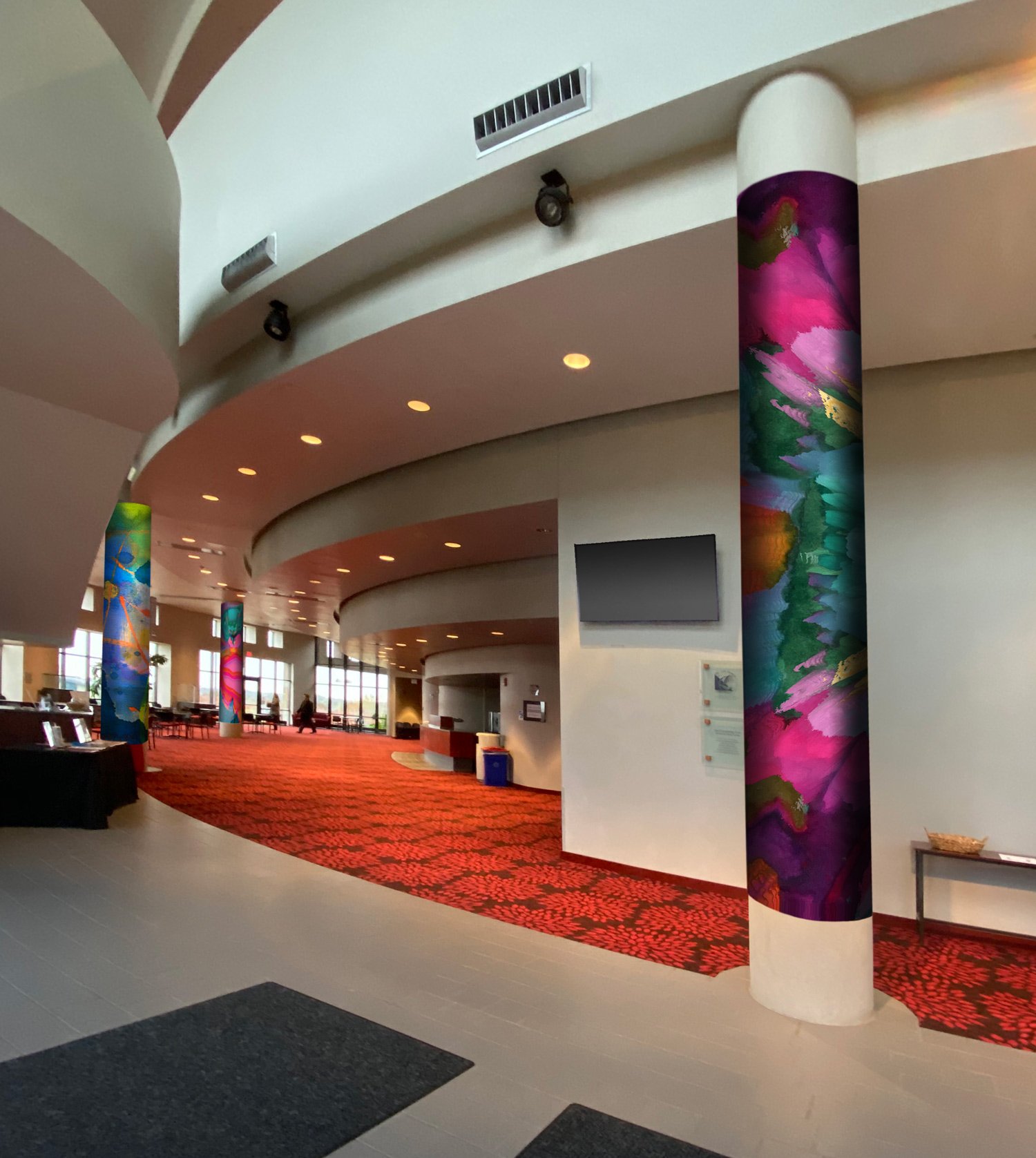
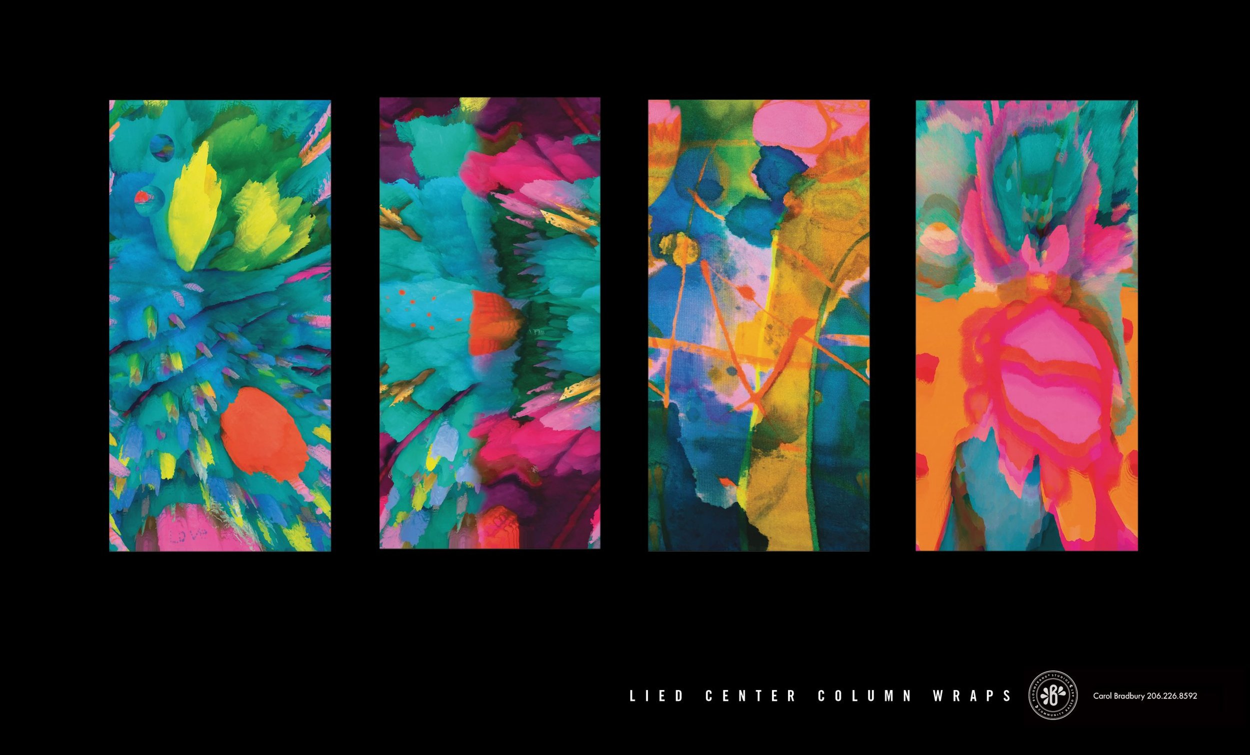
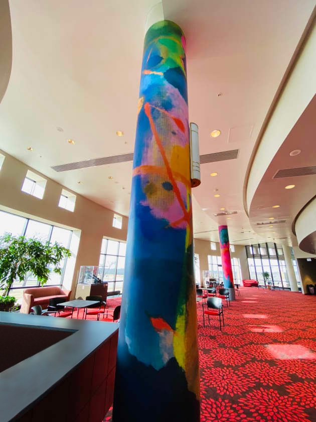
Lied Center of Kansas
Panta Rhei: Everything Changes, Everything Flows
Community-based art, architectural/environmental graphic design
Quincy Elementary
We Are the Garden, We Are the Earth
Brand/Identity, community based art, interior & exterior signage, video, story
Main Street Brewster Place
Liminal
Architectural glass, community based art, signage
Greenery NYC/Greenery Unlimited
Brand/Identity, website, vehicle wrap, packaging, marketing materials
Mulvane Art Museum
Brand/design system to update and unify communications for their 100th Anniversary
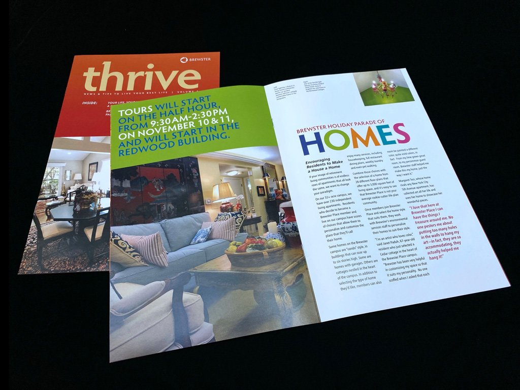
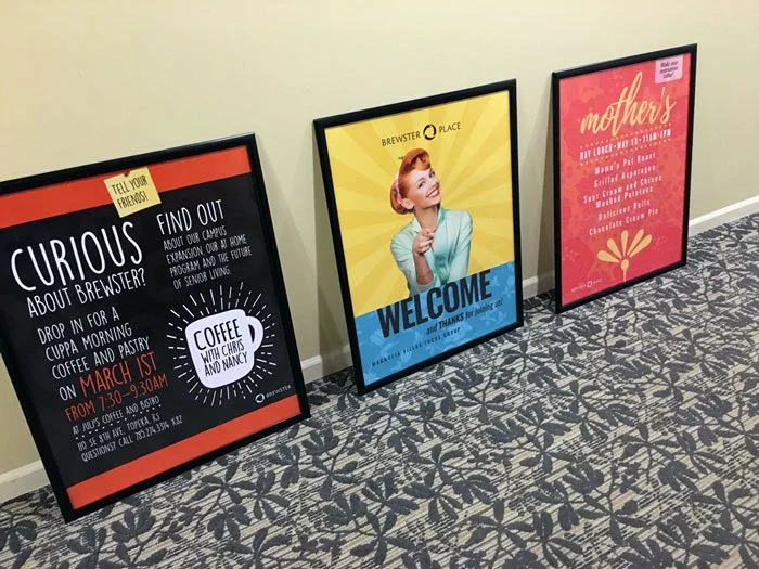
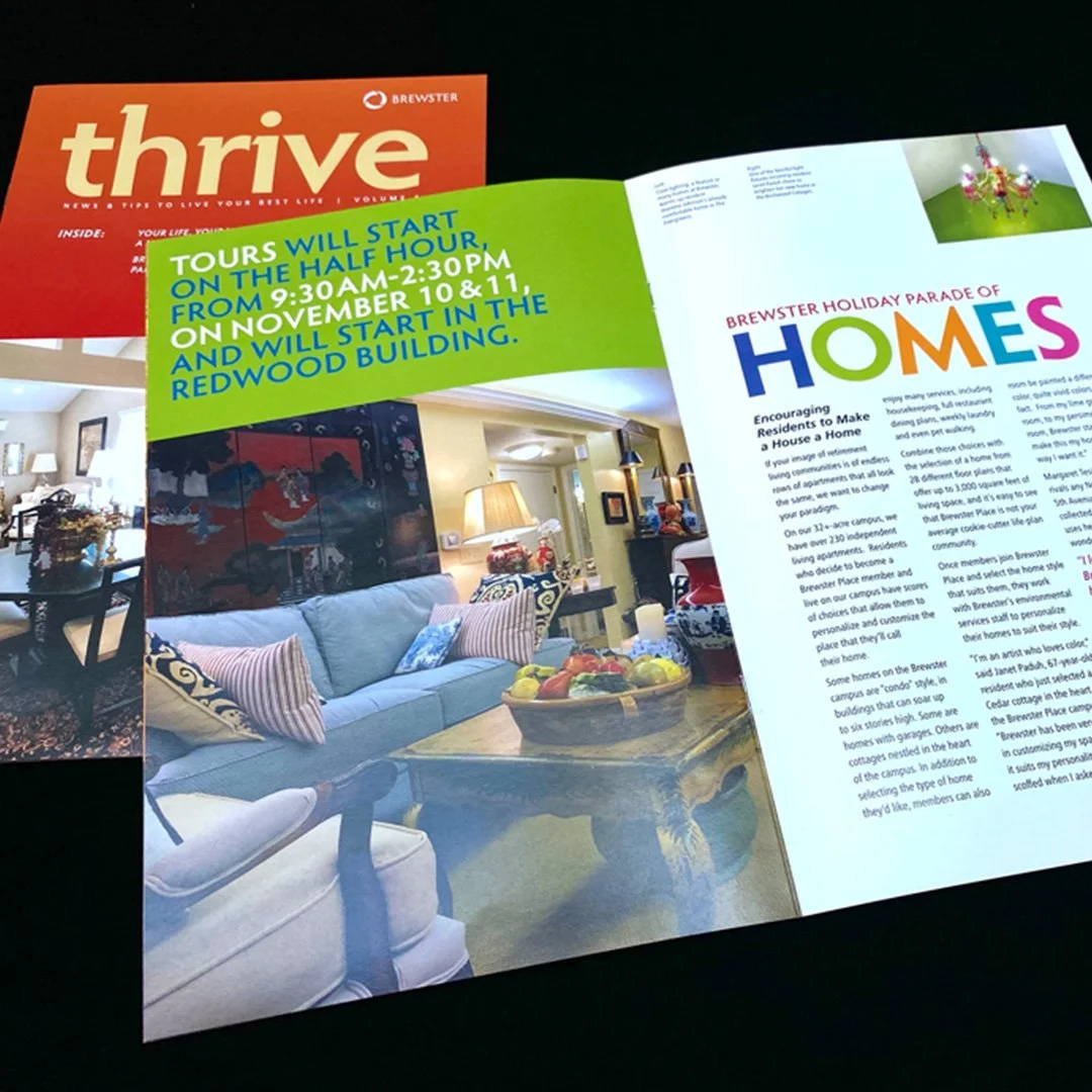
Brewster Place
Brand/Identity, quarterly magazine, website, brochure, recruitment/marketing materials, power point presentations
The Lied Center of Kansas
Panta Rhei: Everything Changes, Everything Flows


Each Bloomerang project is informed by the idea that we are all part of an interconnected whole, in a fluid relationship with ourselves, each other and our environment. Our collaborative art-making workshops engage and challenge participants to shift their perspective from I AM to WE ARE and witness the impact of their contributions in the real world.
“We wanted to create a project that would engage all the elementary art teachers and their 3rd/4th graders to celebrate 25 years of partnering with the Lawrence Public Schools. Carol’s unique process of art making and design connected all of the dots for us.” — Anthea Scouffas, Engagement and Education Director at the Lied Center.
Community-based art / environmental graphic design
-
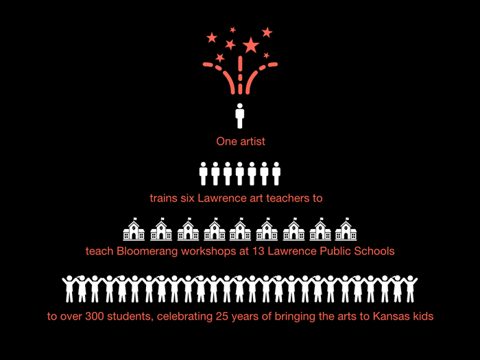
In celebration of the 25-year partnership with Lawrence Public Schools, the Lied Center invited over 300 3rd and 4th grade students and their art teachers to participate in a unique and interactive art experience led by artist, Carol Bradbury.
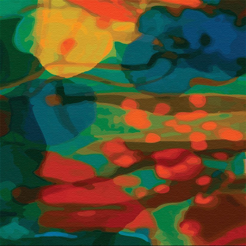
The result—a visually stunning installation of four lobby column wraps that the artist evolved from students working and playing together.
“It was interesting to see the students work together and say, ‘This isn’t just mine, it’s everyone’s.’ The whole thing was just fun and the kids loved it.” —Lara Wallace, Quail run Elementary School
-
• Celebrate a 25 year partnership between the Lied Center and Lawrence Public Schools
• Arts Integration. Give students an experience of collaboration that results in a real world application.
• Wrap the huge, concrete columns to warm up and energize the lobby.
• Ensure the art works with the existing carpet color and pattern.
-
Training art teachers to run their own Bloomerang workshops in their classroom not only gave the teachers a fresh take on art-making and a day of fun, it made it possible to include more students in the project.
Together, the teachers chose to work with 3rd and 4th graders across the school district. To introduce the project, Bradbury made a video that challenged the students’ assumptions of what art can be and do.
After sharing the video, teachers led their students through a month of collaboration. Once the collective artworks were complete, the students chose their favorites to send to the artist.
She then used the collective expressions of the students like a musician sampling sounds. Her process discovered colorful resonances that reflect the nature of the Arts, transforming them into an explosion of color that redefines the Lied Center lobby.
“We had an idea of what it was going to be like when it was finished but seeing the real thing…it’s so much better!”
—Julie Rose-Weston, Cordley Elementary Art Teacher
-
“We now have beautiful works of art that have been literally and figuratively touched by so many community members. The work is vibrant and full of life. Every year those students attend the school performances at the Lied Center and enter the lobby, they will see the work they helped create.”
—Anthea Scoufas, Lied Center Engagement/Education Director“As I was leaving the lobby I turned around and I swear it looked like the column was glowing.”
—Marilyn Vanderweide
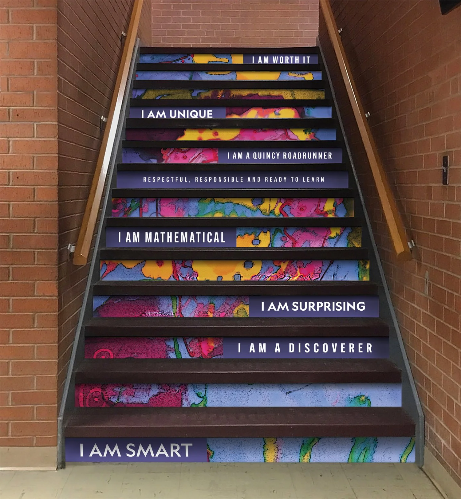
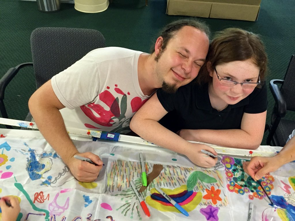
Quincy Signature Art School
We Are the Garden, We Are the Earth.


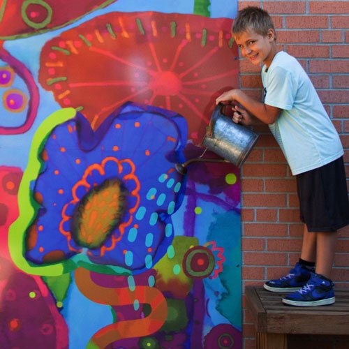


This integrated art project was not only exciting for the students, but also valuable as a way to connect them to the world beyond the school walls.
Brand Identity, Community Based Art, Arts Integration, Architectural Marquis Signage, Environmental Graphic Design, Video and Story
Above: A brief overview of We Are the Garden, We Are the Earth.
-
Quincy Elementary’s signage was in desperate need of a refresh. It was faded, ripped and communicated a sense of disrepair, not a good look for the district’s signature visual arts school.
Principal Jolie Crow and art teacher Ana Diaz recognized how they could use their image problem to give students a real-world experience of working together for the common good and teach their community the relevance of an arts integration curriculum.
-
• Working for the common good. Invite students into an experience of being part of something bigger than themselves.
• Show students how their contributions have a ripple effect of raising school and neighborhood pride.
• Arts Integration. Use art in a real world application to communicate the essence of the district’s visual signature arts school.
• Use the garden as a teaching metaphor, helping students understand their connection with the earth and their environment.
-
Phase 1: Discovery session with the principal and arts integration specialist to understand goals, scheduling and costs
Phase 2: Collaborative art-making workshops with third graders
Phase 3: Design of two exterior marquee signs and two interior staircases
Phase 4: Production and Coordination with printer and installers
-
"The art integration workshops Carol brought to Quincy beautifully illustrate how the arts can plant seeds of awareness, innovation and creativity in the classroom, with real-world applications.
The new signage and branding for our school grew out of challenging second-graders to re-frame how they see themselves, each other, and their community. Together, they have created a positive ripple of energy that's affecting the entire school.”
Ana Diaz, Art Teacher, Quincy Elementary School
The environmental designs and videos the artist produced became a recruiting tool for the school, communicating the value of an arts integrated curriculum.
Creativity fuels transformation. This short video is A CALL TO ACTION motivated by Carol Bradbury’s desire to communicate the power of the arts to inspire change. See if it puts a smile on your face…it’s not just for kids.
Discover how to bring connection and inspiration into your community >>
Main Street Brewster Place
Liminal, glass wall


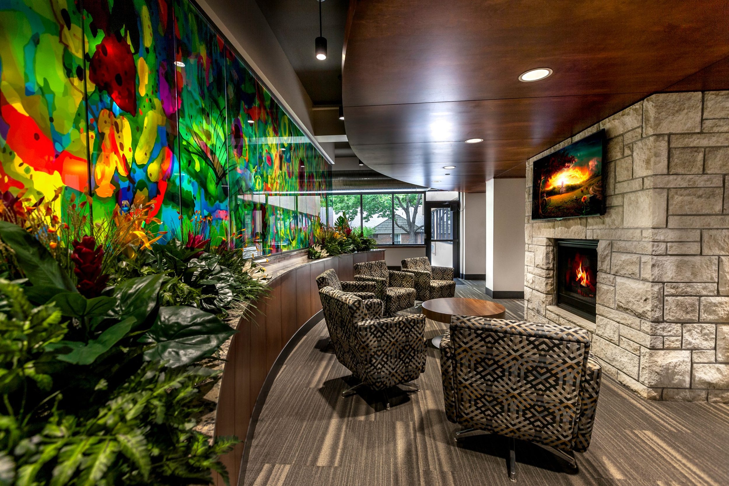


Relying on research that shows color can increase well-being and create a sense of community, Bradbury developed a series of artworks for the new Main Street mixed-used remodel that represent the vibrancy of the residents themselves.
Community Based Art, Architectural Glass Wall, Interior Signage, Wall Art, Donor Wall
-
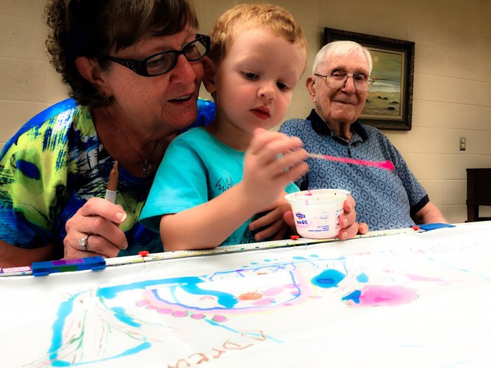
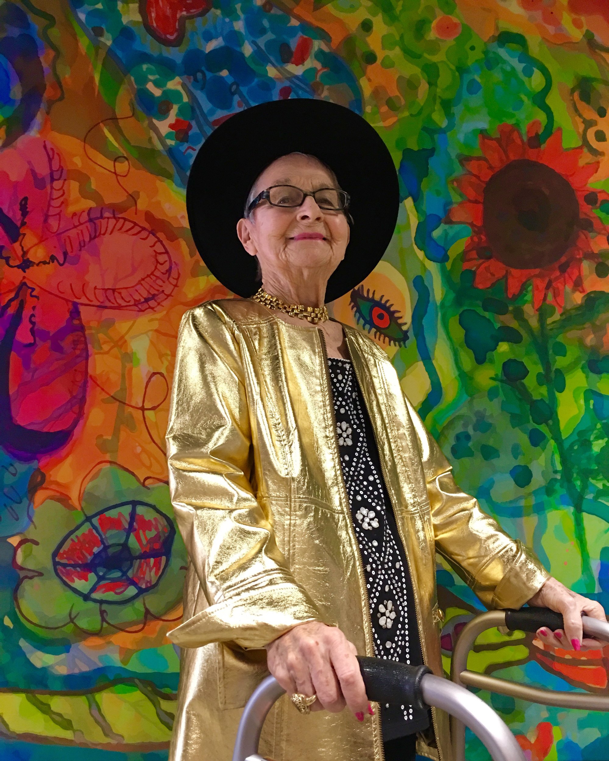
When the CEO of Brewster approached Bradbury about creating a series of special artworks for the residents of Brewster Place, she was eager to engage their voices and honor the people who reside in this retirement community.
Brewster Place is a micro-community with an ecosystem where residents, family members and staff co-exist in an intimate way on a daily basis.
“Many people living in retirement communities live in a liminal space, a transitional space betweeen past and present or present and future. I wanted the final artworks to give voice to that experience,” says Bradbury.
Three artworks were created for the renovation: LIMINAL: Glass wall 6’x26’ / GARDEN OF EDEN: 65″x65″ Fabric / MORNING 65’x120″ Fabric.
-
Main Street at Brewster Place renovations included a new market place, wellness center, beauty salon, chapel, bank, and a pavilion.
The goal of the remodel and the artworks was to begin shifting the paradigm of what retirement living means. Baby boomers are demanding a more active lifestyle and more modern accommodations.
These artworks serve to reinforce that shift, bringing color and energy into the space that reflect the people themselves.
-
Intergenerational workshops. Bradbury invited not only the residents to participate in the collaborative art-making experience, but also volunteers, staff and family members – including children and grandchildren.
Over 100 individuals participated in the “drop-in event,” discovering their inner child and reflecting their life experiences in the art itself.
Once the crowd-sourced artworks were digitized, the artist shifted from analog to digital, using the participants’ marks as a medium to explore new compositions that reflected the community in unique ways.
Working with the architect and support team, the artist was able to address a series of technical challenges regarding the glass artwork installation.
After the installation was complete, Bradbury designed a signage system that unifies the new space and completes the transformation.
-
As we finished installing the artworks, a long-time resident looked around in wonder and exclaimed, “We’re not dowdy old Brewster any more!”
A guest shared her experience of ‘LIMINAL’, saying “It feels like people talking.” For a population that often feels unseen and unheard, this was exactly the effect the artist was hoping for.
Community pride has risen and visitors regularly comment on the vibrancy of the artworks.
Bradbury considers herself a portraitist at heart, using what she finds in the immediate environment to inform her work. “My medium changes but creating work that reflects the soul of a people and place is my passion.”
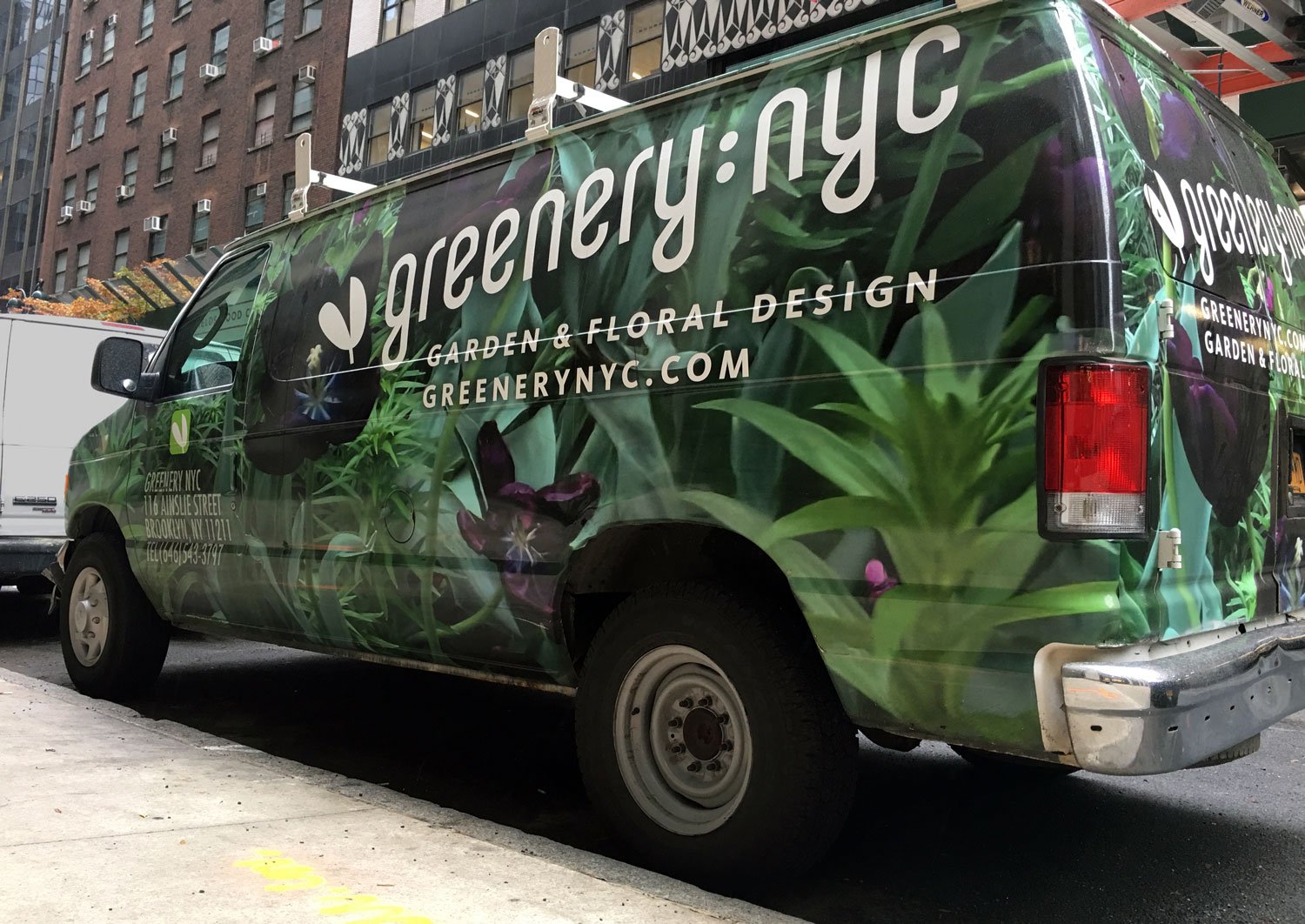
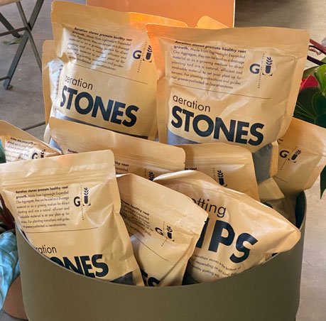
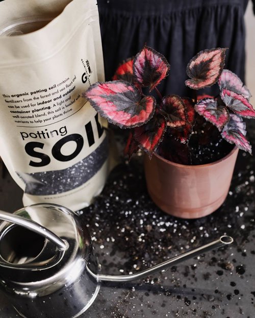
Greenery NYC / Greenery Unlimited
Blending the Science of Horticulture with the Art of Design
Greenery NYC proved its concept in a rented out Brooklyn garage, launching the startup with a dream and a strategic brand design. Ten years later, it's a multi-million dollar company.
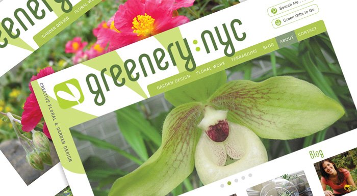


Rebecca Bullene had a mission: to bring the beauty of nature indoors to create more comfortable, attractive, and productive places to live and work. But how do you move from idea to implementation?
Brand/Identity, website, packaging, vehicle wrap, marketing materials
-
We wanted to launch our brand and inspire prospective customers about what might be possible for their space using our creative services. We knew that it would be hard to gain traction as a female founded business in a male dominated field, so we needed our website to communicate both our design prowess as well as our construction capabilities and set us up as a trustworthy, experienced, and innovative leader in landscape design.
We reached out to Carol to help launch the new brand, Greenery NYC and we’re glad she said yes!
A few years later we came back. We wanted to open a brick and mortar store and online shop to showcase our work and respond to customer demands for plants and pots.
We wanted Greenery Unlimited to feel connected to Greenery NYC but have its own identity. Carol nailed it with a sophisticated design that integrated the original ‘plant doodle’ in the new design.
-
Carol intuitively understood the tone we wanted to communicate to our customers and developed amazing brand assets to help create the visual representation of our company ideals. She’s a very talented designer. Without her work on our brand launch I don't think we would have become the multimillion dollar company we are today.
-
The Greenery NYC website launch was a major success with new customers coming in within a week of launch. The brand story Carol created has carried us from a one-woman operation to a team of 40 a decade later. We credit Carol's vision and design of our website and brand as the driving force behind our successful launch.
Read more about Greenery NYC’s journey in the New York Times.>>
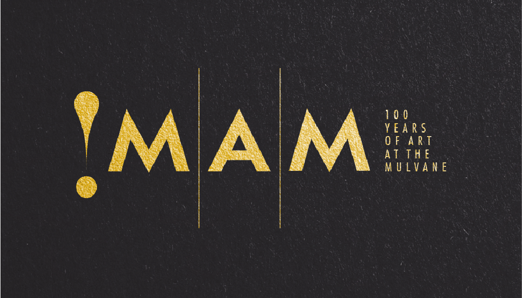
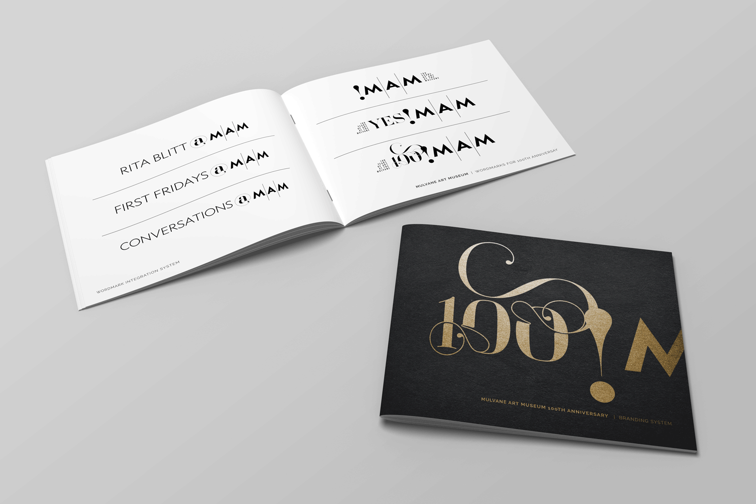
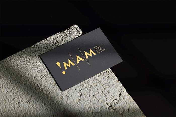
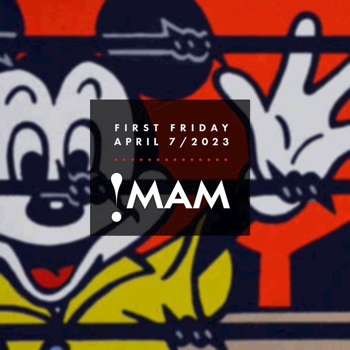
Mulvane Art Museum
Education is the heart of the Mulvane and the collections are its soul

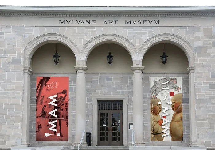


The Mulvane was originally established to provide opportunities for the community to interact with artists and the arts. Throughout the decades, MAM’s focus has turned to utilizing the arts as a way to engage communities, scholars, artists and students in explorations and conversations about art, art history, social justice, and a wide variety of contemporary issues.
100th Anniversary branding and design system to update and unify the museums visual communications
-
Our collections are world class. Art museums and galleries from across the country regularly request to borrow works from our museum. Our branding didn’t match our reputation.
Our visual communications were inconsistent. We didn’t have a system in place to create a cohesive look or to build a consistant presence on social media. Visually, we were all over the place.
With our 100th anniversary fast approaching, it was the perfect time for a brand refresh.
-
I’m very ‘hands-on” so I needed a creative partner that would work closely with me.
Carol’s a multidisciplinary artist as well as a brand designer. She has the understanding and experience of weaving together strategy, passion and vision. Her work is sophisticated and timeless…the mark of an exceptional designer.
-
“Carol listened carefully when I explained the mission of the museum and my vision for the next 10 years.
She created a typographic solution and an integrated communications system that’s both flexible and expandable. It’s celebratory, sophisticated and easy for us to use.
She understood how to visually articulate the essence of what I wanted and brought it to life, imbuing it with immediacy.” —Connie Gibbon, Mulvane Art Mseum Director
And the feedback?
When long-time Friends of the Mulvane board member, Eileen Cain, first saw the new branding she exclaimed, “WOW…finally…the missing piece! Our updated brand now aligns with our world-class collection, educational programs and future vision. It feels fresh, sophisticated. We could be a museum or gallery in NYC or London.”
Brewster Place
Rebranding for a new demographic


Brewster Place needed a new strategy to attract new residence in the 60 to 70 age category.
“We needed a branding expert to come in and help us change the paradigm from ‘nice, but stuffy’ to ‘exciting and resort like.’” —Claudia Larkin, past COO
Brand/Identity, quarterly magazine, website, presentation folders, marketing materials, power point presentations
-
Brewster Place is a well known continuing care community. While Its reputation was very positive in the community, it was also known as a place for “old” people. Brewster had embarked upon a strategy involving attracting a younger audience. To do that we needed a branding expert to come in and help us change the paradigm from “nice, but stuffy” to “exciting and resort like.”
-
Having done some prior work with Carol, we knew her depth with regard to analyzing brand and developing colorful new standards that would engage our current resident base in the process.
She took our brand and flipped it on its head, with a new strategy to attract new residence in the 60 to 70 age category. She integrated our new tag line, “Lock the door and go” and made it Brewster’s own.
-
Our rebranding included bricks and mortar construction of 18 dynamic new independent-living high-end villas designed to appeal a younger affluent audience. With Carol’s marketing pieces, we exceeded our goals of selling all villas before construction was complete.
h i g h l i g h t s


Here’s what our clients say
-
"Our website launch was a major success with new customers coming in within a week of launch. Without Carol’s work on our brand and website, I don't think we would have become the multimillion-dollar company we are today. Good design is worth the investment."
Rebecca Bullene, Co-founder, Greenery NYC / Greenery Unlimited
***** -
"The huge column wraps for our main lobby are beautiful works of art that have been literally and figuratively touched by so many community members. The work is vibrant and full of life, celebrating 25 years of creative partnership between the Lied Center and Lawrence Public Schools."
Anthea Scouffas, Engagement/Education Director, Lied Center of Kansas
***** -
"We had an idea of what it was going to be like when it was finished but seeing the real thing…it’s so much better!"
—Julie Rose-Weston, Cordley Elementary Art Teacher
-
"We needed a branding expert to help us change the paradigm of nice, but stuffy to exciting and resort-like. Our target audience for the dynamic new independent living villas we'd designed was a younger, affluent audience. Carol took our brand and flipped it on its head with a new visual strategy to attract residents in the 60 to 70 age category. We exceeded our goals, selling all villas before construction was complete."
Claudia Larkin, former COO, Brewster Place
***** -
"The art integration workshops Carol brought to Quincy beautifully illustrate how the arts can plant seeds of awareness, innovation and creativity in the classroom with real-world applications. The new signage and branding for our school grew out of challenging second-graders to reframe how they see themselves, each other, and their community. Together, they have created a positive ripple of energy that's affecting the entire school."
Ana Diaz, Art Teacher, Quincy Elementary School
***** -
"It looks like me, but it feels like me. WOW!"
Theodore L. Dorpat, Psychiatrist and Author
***** -
“The glass installation and resulting artwork are simply transformative. The renovations by Architect One were quite innovative, but once the artwork was unveiled, we knew the project was complete. There’s a renewed energy now at Brewster.”
David Beck, former CEO, Brewster Place
***** -
Carol has a unique ability to listen, understand your vision and visually articulate its essence, bringing it to life and imbuing it with immediacy.
—Connie Gibbons, Mulvane Art Museum Director
*****